Problem
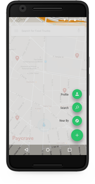
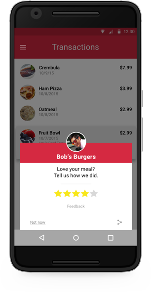
Several mobile payment solutions exist currently, like Square Cash or PayPal mobile. However when pertaining to food trucks, a well-designed solution hasn't been created. This consumer app allows users to discover nearby food trucks, and select food to purchase. Users can also view their previous transactions, and provide feedback for each food truck they've purchased from.
User Stories
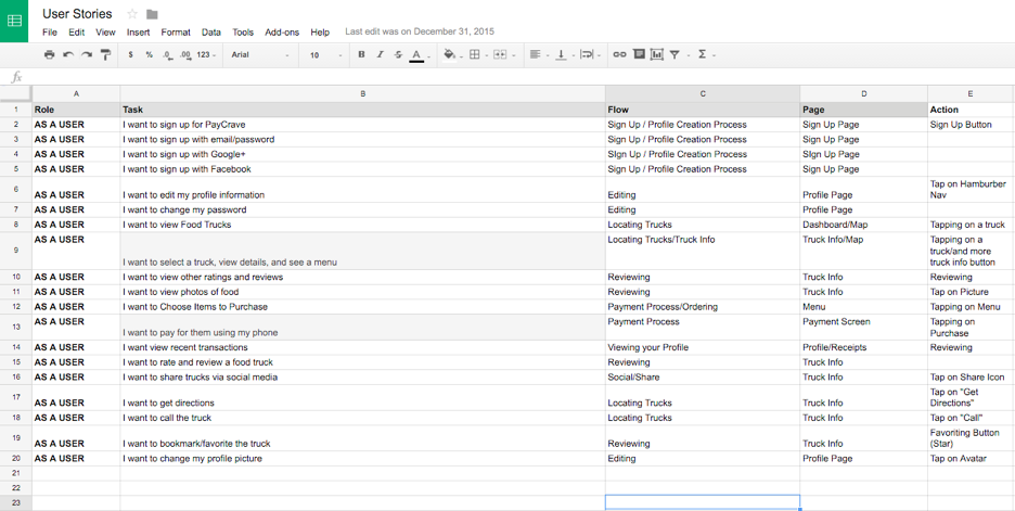
In order to solve this problem I would need to do some research. I made some surveys and sent them out on social media and visited some local restaurants. Based on the feedback I got I then made user stories to help me identify what features to include in the app.
User Flows
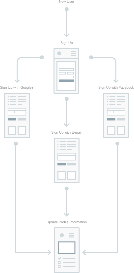
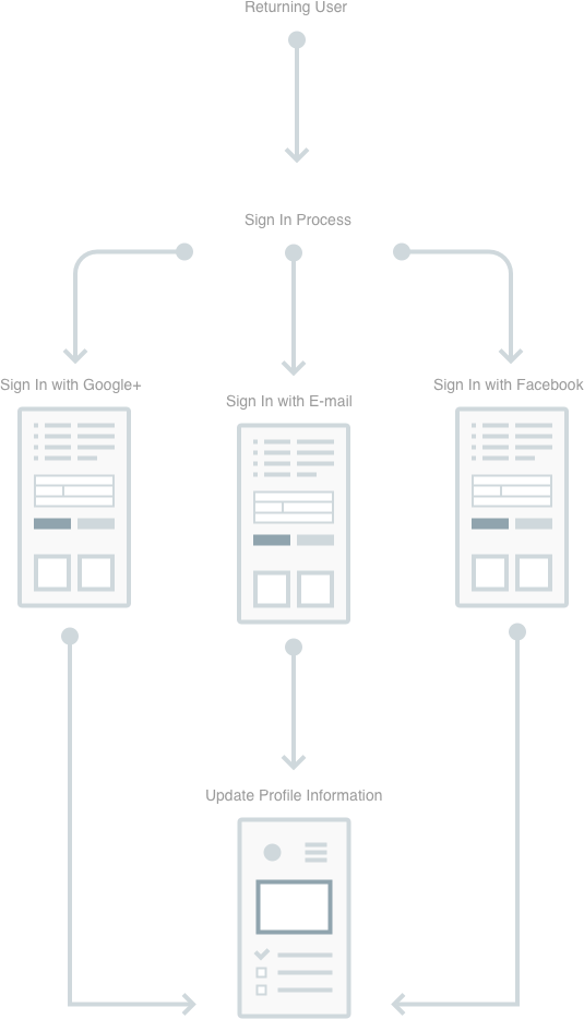
After deciding on the features, I then wanted to show how a user might navigate through the app. So I made some user flows to help illustrate that.

Style Guide
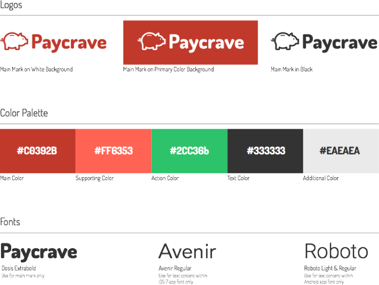
I used this style guide to help me keep my UI consistent throughout the entire application.
Screens
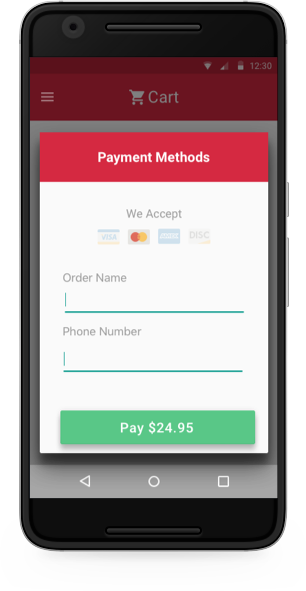
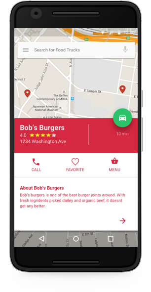
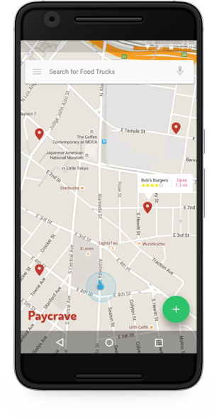
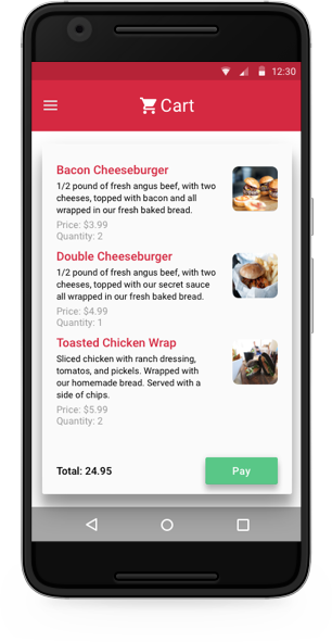
Here are the screens I desgined after conducting the research and wireframing in Balsamiq.
